Jibble's WeBlog
Do I contradict myself? Very well, then I contradict myself, I am large, I contain multitudes. - Walt Whitman
|
I've been thinking about hockey sweaters ever since Tom Hunter, over at Mile High Hockey, and I had a good natured back-and-forth about the Avs Stadium Series Sweaters, because he likes them. In a possibly related note, I heard he rinses his contacts in bleach every night. Even though those jerseys suck, Tom has a point: The NHL is boring, uncreative and overly conservative. Teams run out the same 3-4 striped patters of Red, Blue, Black & White and maybe, if they feel frisky, Yellow. NHL teams should experiment more. And sometimes experiments will fail, and come will go off the rails (like the Avs and Kings Stadium series). But It's fair to ask "If I don't like the Stadium series, what are some creative ideas that could still look good." So here's my ideas. (Note: Below are some links to concept jerseys at Icethetics.com. Click the links for those. Color (Tinctures) 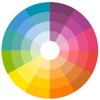 Here is a color wheel  With a few precious exceptions; here is the NHL's color wheel Nearly every team has a combination of Black, Blue, Red, & White as their color combo. A few teams throw in some Yellow. Here's the 7 teams whose home jerseys are not Red, Black or Blue: San Jose Sharks (Teal), Dallas Stars (Green), Minnesota Wild (Green), Vegas Golden Knights (Dark Gray), Philadelphia Flyers (Orange), Nashville Predators (Yellow), Edmonton Oilers (Orange) Only in the NHL could a team get creative credit for using " Dark Grey". Meanwhile the following colors sit either completely or mostly neglected; Orange (1 Primary, 3 secondary), Green (2, 1), Baby/lt Blue (0,1), Maroon/Burgundy (1, 0), Teal (1, 0) Purple (0,0), Pink (0,0), Brown (0,0) Here's some teams that could add some to their looks (Why does no team have Green and Gold or Maroon/White? Those are classic timeless beautiful color schemes):
And teams that could do an entire redesign:
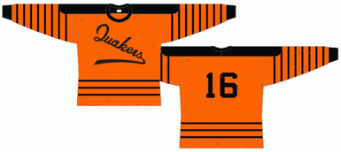
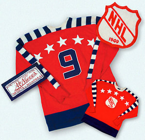
Why always White? Sports went to "Home and Away" Color vs White schemes so people could see them on Black and White TVs. This is no longer necessary. We need color vs color match ups. Why can't Edmonton have an Orange home and Blue away sweater. Calgary would look amazing with Yellow "Homes". Or Nashville/Buffalo with a Blue and a Gold one. OR the Avs a Burgundy one and a Blue one (not just an alt.) Only a few teams need a white sweater, as constructed (Toronto, Tampa, Detroit, Carolina, LA, NYR, NJD, CBS) "Charges"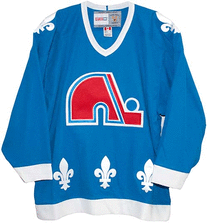 And there's "charges" (shapes and designs) Heraldic components lead itself well to Sports Design, because both have the same idea: unique designs that can be identifiable at distance and close up. So sports teams should use heraldic elements in their design! It's an art form that spanned and was refined for 100s of years. Charges are just basically geometric shapes. Stars. Circles. Fleur-de-lis. Hockey,a nd the NHL, has a history of using charges successfully in designs! Who knows why they stopped (besides they got boring!). But the NHL has great examples, like... The Quebec Nordiques:
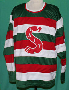
Teams that could use them: Vegas: https://www.icethetics.com/concepts/something-that-sparkles Washington (Stars!): www.icethetics.com/concepts/faux-retro-caps Chicago (Chicago city flag star): www.icethetics.com/concepts/chicago-city-edition Kings (Crowns, like Sweden) Stars Lightning Carolina (They use the Huricane flag already, and it looks great) Colorado (Yellow roundel in state flag) Columbus: www.icethetics.com/concepts/columbus-reset Stripes 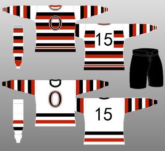 Somehow, the NHL has reverted to the same three stripe patterns. Montreal's Cotticed stripe, 2 stripes (like Chicago and Toronto) or three stripes (like Edmonton) There's some linked Concepts: Washington: www.icethetics.com/concepts/faux-retro-caps NHL All Star: www.icethetics.com/concepts/all-star-throwback But... the NHL has a long history of a variety of stripes, such as Ottawas classics
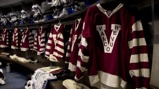
Or these:
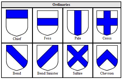
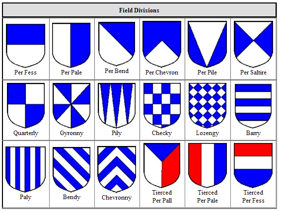
 Teams that could incorporate stripes: Literally all of them. There's not a team that couldn't look sharp with some stripes. "Ordinaries" & "Field Divisions" One thing teams could use are: Ordinaries & Field divisions (see below).
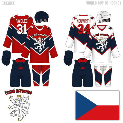
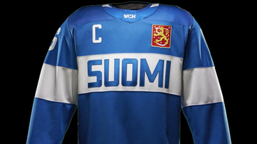
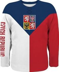
How might some of these translate to a Hockey Sweater... well here's some concepts that look pretty good. Bend: https://www.icethetics.com/concepts/americas-day Gyronny: https://www.icethetics.com/concepts/southwest-stadium Tierced: i.ebayimg.com/00/s/NTY3WDQ3MA==/z/JZ4AAOSwrklVNRuW/$_35.JPG Chief: i.ebayimg.com/images/g/KF0AAOSwfypcmmRh/s-l1600.jpg Fess: Image Link Chevron Reversed: http://3.bp.blogspot.com/-joc9c5oXoxg/VMql5uF-ITI/AAAAAAAACvw/SmqRnQdmsM0/s1600/teamczech.png
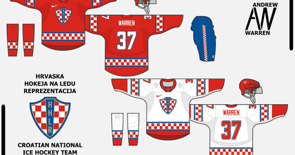
 Patterns & "Furs" Similar to Ordinaries and Divisions, but maybe on a smaller scale. Japan's soccer jerseys are amazing example of how a small little pattern (fur, in heraldry speak) can turn a hum drum uniform into something sharp, like Japan's Soccer Jerseys 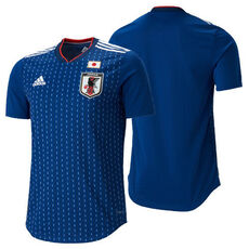 Or, how about a checkered pattern concept
Conclusion The NHL doesn't have to go totally crazy and bizarre and tacky to have great, modern and unique designs. They just need to add some variety: color, graphic & pattern, as it's the spice of life.
0 Comments
Leave a Reply. |
Jibbles - Denver-ish, COI used to write about the Avalanche. Now about whatever. All opinions are ill-informed Archives
November 2020
Categories |

 RSS Feed
